La Quinta Nube
Branding Project
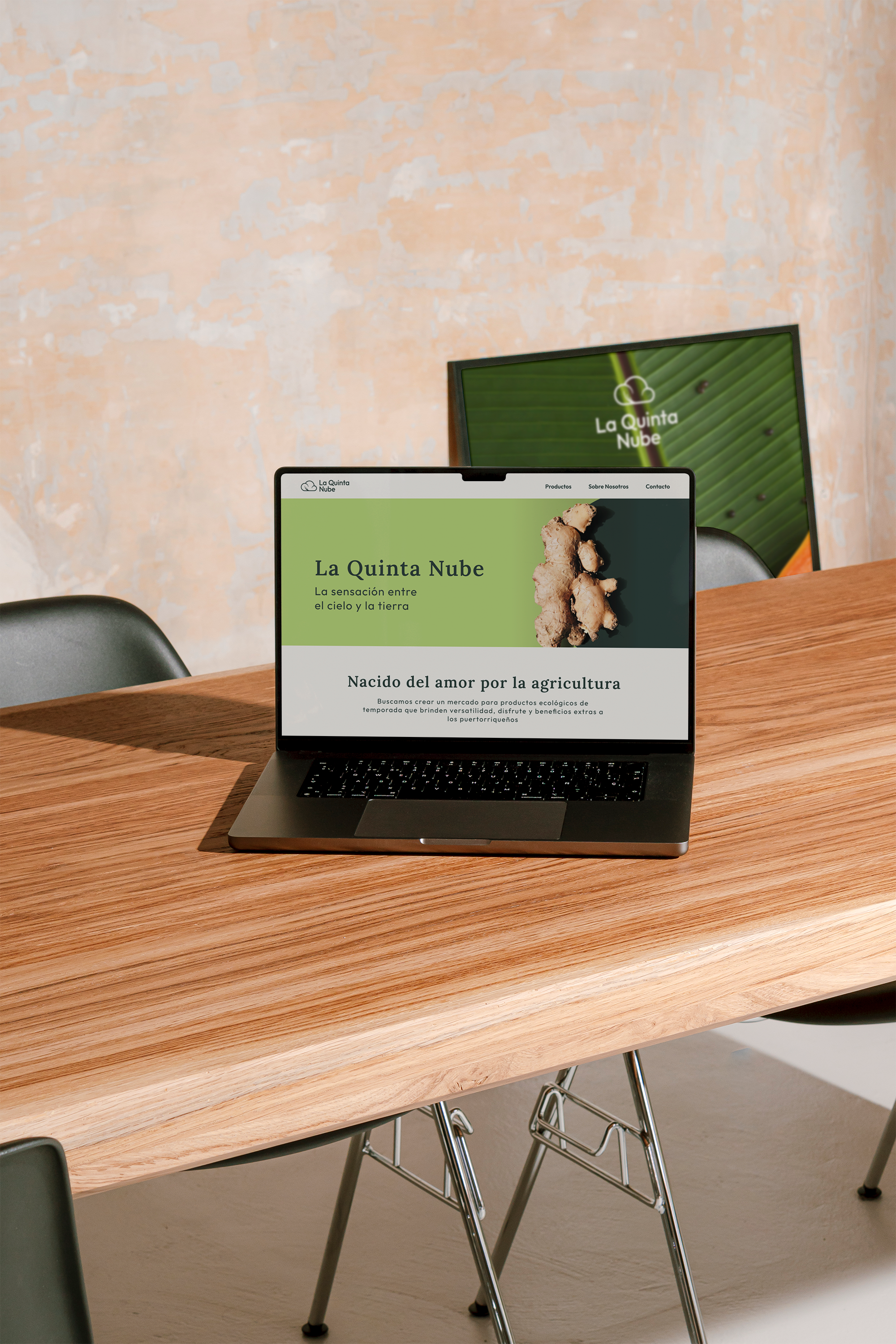
La Quinta Nube is an agricultural startup based in Puerto Rico. Founded by Alejandra and Juan, the brand seeks to capture the essence of Puerto Rico’s mountain peaks—evoking elevation, freshness, and the feeling of being among the clouds.


The strategy focused on competitor analysis, brand personas, key differentiators, and insights to define a solid foundation. A central goal of the creative brief was developing a logo that incorporates the cloud (la nube), a core element of the brand name, while clearly connecting to organic agriculture and natural products.
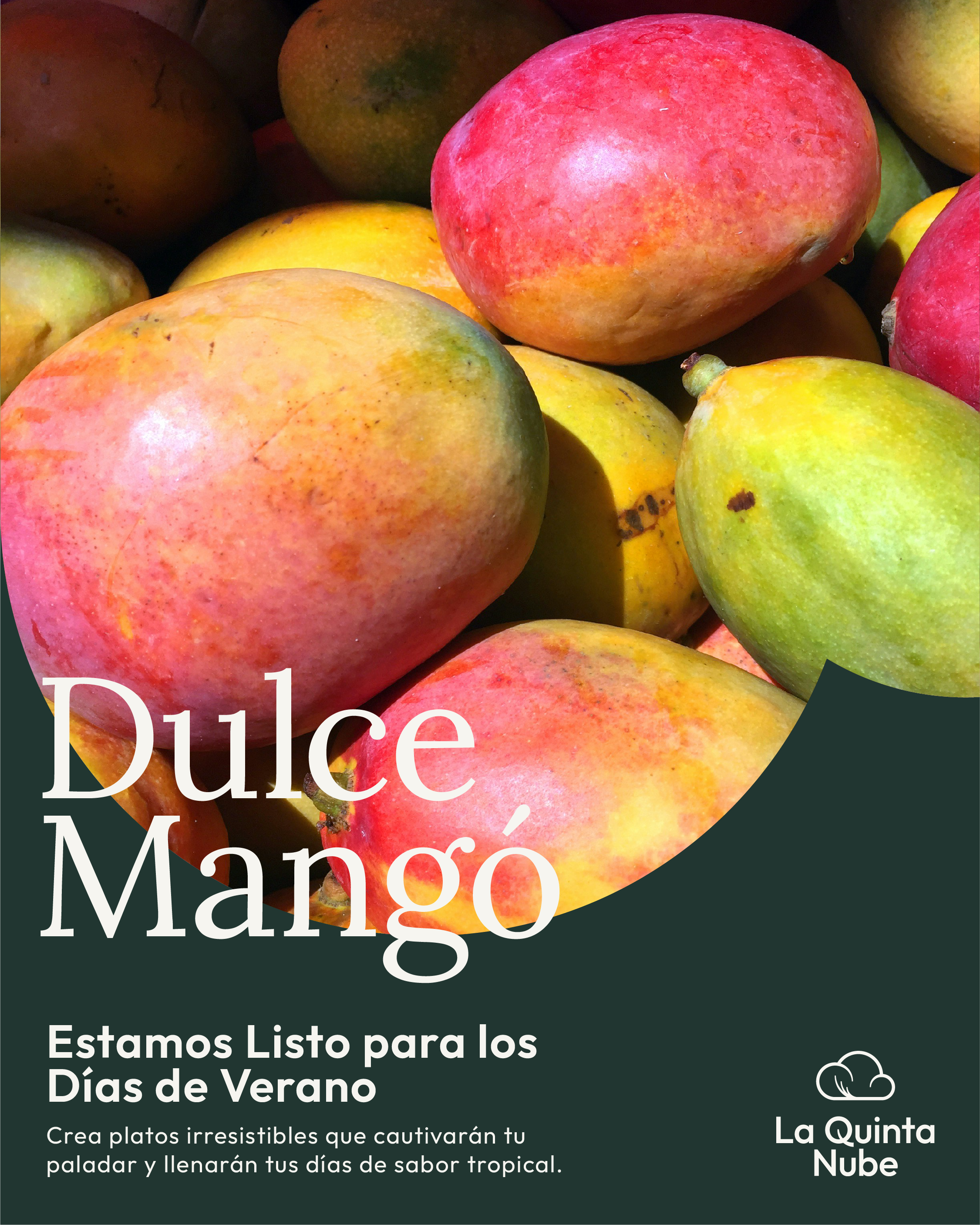
La Quinta Nube offers a market for organic, seasonal crops and value-added products that provide versatility, enjoyment, and added benefits to the Puerto Rican community.
Brand Strategy

Rooted in Puerto Rican agriculture, the identity was designed to appeal to diverse markets while balancing a youthful yet serious tone.
Art direction emphasizes the product, the agricultural process, and the experience of sharing and tasting. Natural light and thoughtful illumination highlight product quality and benefits, supported by a color palette inspired by the natural hues of the crops and ingredients.
The IDentity

Two typefaces create contrast and visual rhythm:
Lora: a serif typeface that adds sophistication and an organic feel
Outfit: clean, rounded sans-serif that brings a modern and approachable tone